
Every agency knows the moment: the creative is ready, and the review turns into a debate of opinions. Inbox Maestro gives everyone a neutral reference instead, grounded in attention science and campaign data: what your clients' subscribers will see first, screen by screen, on desktop and mobile.
Analyze Your Next Pitch Campaign →Inbox Maestro is already used by teams at Orange, SNCF Connect & Tech and Generali.
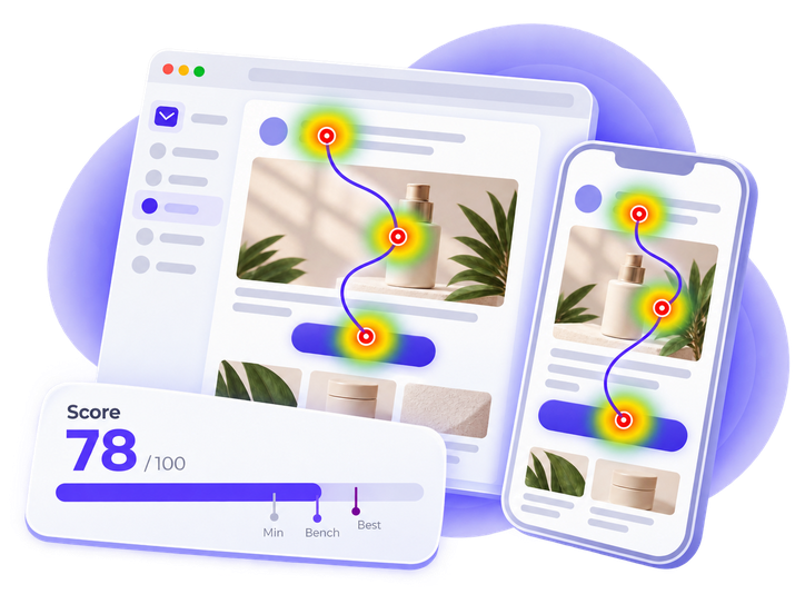
A design reviewed in seconds. Feedback driven by personal taste. A team left defending its work with conviction alone. Predictive attention analysis gives everyone in the room the same neutral, data-based reference: what readers are likely to see first.
“Trust us, we know email.”
“Here is what your readers see first today, and what they miss.”
“I'm not sure about it. Can we try another version?”
“The offer and the CTA are seen on the first screen, on desktop and mobile.”
“It looks better, doesn't it?”
“Visual clarity is now above the benchmark on both devices.”
“Here are last quarter's opens and clicks.”
“Here is how each campaign scores against the benchmark, and what to improve next.”
Less debate. More confidence, on both sides of the table.
The same analysis serves your own quality control and your clients' campaigns.
Check templates and redesigns before the client sees them: from a mockup image, before any HTML integration, then at HTML stage with the technical and accessibility Checkup. Fewer feedback rounds, and a delivery whose quality is demonstrated rather than argued.
A test email sent from the client's platform to a dedicated address is enough. Checkup, AI Insights and predictive eye tracking in one report: what readers will see first, what may hold back the click, and what to improve, on desktop and mobile.
Predictive eye tracking and full campaign analysis, delivered in a report you can share as is or build your own recommendations on.
See what draws the eye in the first seconds of viewing, screen by screen, on desktop and mobile.
One score per device: is the design clear enough for a strong first impression?
Submit an image of the design before HTML integration. At HTML stage, the technical and accessibility Checkup and the AI Insights complete the report.
Your logo on every report, shared with your clients and stakeholders when you decide, or kept as the evidence behind your own deliverables. Powered by Inbox Maestro.
Not one more opinion in the room: a method you can explain to your client in two sentences.
Built on eye-tracking research, it models what draws the eye in the first seconds of viewing.
Each Visual Clarity Score is set against campaigns already analyzed, with a recommended minimum and a best-in-class mark.
Screen by screen, on desktop and mobile, developed by the Viaretina team.
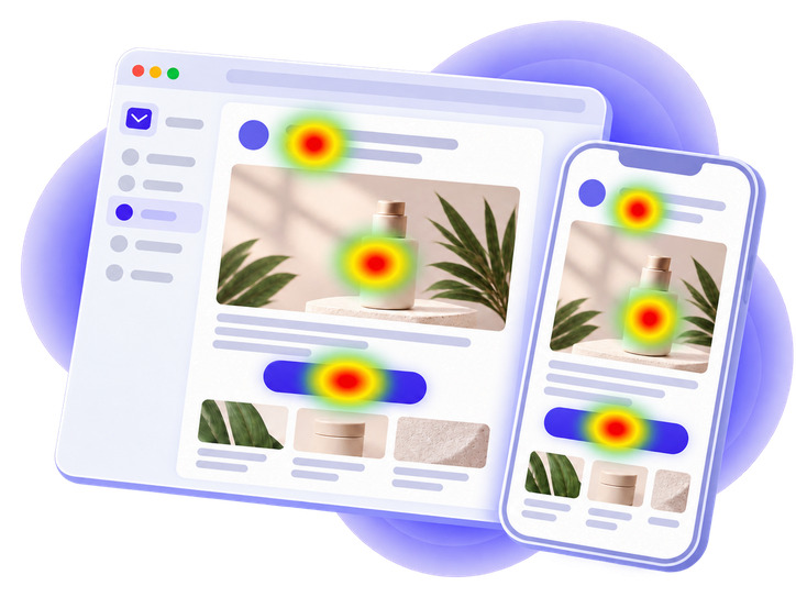
A predictive analysis of attention in the first seconds of viewing. It does not replace testing with real users or your creative expertise: the tool brings the evidence, you keep the recommendation.
A mockup image, HTML code, or a test email sent from your client's platform to a dedicated address.
Attention heatmaps and a Visual Clarity Score for desktop and mobile. At HTML stage, Checkup and AI Insights are included.
Send the report to your client as is, or bring its findings into your own recommendations and deliverables.
Two ways to work together, one pool of credits for all your clients' campaigns.
Your clients' campaigns are analyzed in a controlled environment designed for professional marketing teams. No personal data is needed for the analysis.
Share a mockup or a test email from your next pitch, and walk through its analysis with the team behind the product. Partner program details on request.
Analyze Your Next Pitch Campaign →Short answers here, the full reasoning in our guides.
Everyone in the room already knows the brand, the brief and the offer. A subscriber discovers the email cold, in a second or two, on a phone. Without a shared reference for that first glance, personal taste fills the gap and the loudest opinion wins.
See how readers actually scan an email →Where attention is likely to land in the first seconds of viewing, screen by screen, on desktop and mobile. It is built on eye-tracking research, not on clicks or opinions. It does not predict conversion; it shows whether the headline, the offer and the CTA get seen at all.
Read the guide on email attention heatmaps →One score per device, from 0 to 100, measuring whether the design is clear enough for a strong first impression. It is set against campaigns already analyzed, with a recommended minimum, a benchmark and a best-in-class mark, so a client can read it without a methodology lesson.
See the score in the Eye Tracking report →Yes. A mockup image is enough for the attention heatmaps and the Visual Clarity Score, which is when a change costs the least. At HTML stage, the technical and accessibility Checkup and the AI Insights complete the report.
See the Mockup Review →Two ways. Share the co-branded report as it is, with your logo, to clients and stakeholders. Or keep it as the evidence behind your own deliverables, where your recommendations live. The analysis stays neutral; the reading stays yours.
Browse all the guides →